These are my reviews of all of the websites of the candidates running for County Commissioner! I will be looking at web sites in other races in the coming weeks. Let me know what you think!
District 1
 Alice Gordon, (Democrat) "An Experienced and Dedicated Leader,” is looking to be re-elected in District 1. Her website (http://www.alicegordon.com) starts out addressing the voters of Orange County. Gordon says she will work for: excellent schools, environmental protection and wise land use, regional transportation and multi-jurisdictional, responsive county services, and efficient, effective, and fiscally responsible county government.
Gordon’s site is very straightforward and easy to get around. But it does not look like much time was spent on the design. It does have a lot of pictures of Gordon, but there are nine categories (Home, About Alice, Will Work for, Leadership, Accomplishments and Goals, Environmental Record, En Espanol, Contact/Volunteer, Endorsements) located on the left side of the site to click on, and that is it.
One of the great aspects of her website is the “En Espanol” section. I think that was smart and shows that she is thinking about all voters. A problem with the Endorsements page is they are all from the 2006 election, not 2010! That is something that should be updated for a re-election campaign.
Overall, the website is very basic. All white, with blue and black text. It does not link to any social media like Twitter or Facebook. It does include how to contact her and contribute, which is key. This website just does not have the “wow” factor. Candidate websites are extremely helpful and can be beneficial to a campaign, this one - like the endorsements section - is outdated.
“I will continue to do my homework, ask the hard questions, and listen to your concerns. You know you can count on me to do what I say. I would appreciate your vote on election day. Thank you." Nice little rhyme there.
District 2
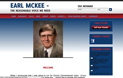 Earl McKee (Democrat) “The Reasonable Voice We Need.” He is running for the District 2 Commissioner’s Seat. He says that many people asked him why he was running. He answers them in the opening “Welcome” portion of his website (http://earlmckee.com). “I am a lifelong resident of Orange County and received my education in the Orange County Schools.”
In the issues section, McKee tells us what he is about. “I believe that we must be frugal with our spending. It is crucial that we maintain our exceptional school system for our children. We must continue to provide adequate law enforcement, fire protection, and emergency medical services for all our citizens. It is also necessary to provide waste collection/recycling and disposal. There are essential county offices which must continue to operate as well as county agencies such as public health and social services.”
McKee has some great aspects to his website. At the bottom of the page he has “recent news,” this can be updated when something major happens with his campaign. He also has a “sign-up” section that is more in depth than Gordon. You can choose from a number of boxes of what you would be interested in doing and submit your email address. This is a great way for McKee to show that they will be in contact with you if you make the decision to volunteer for McKee.
Another asset to his campaign is the survey he put on his website. You fill it out with your name and email address, and then there is a ranking of the issues that you find most important. This shows McKee is interested in what the voters find most important. The website also has a place where you can make contributions online. This makes it easy for people to contribute to his campaign. In the top right corner, there is a “stay informed” link where you enter your email and zip code, having this option is a great way to keep voters updated on what a candidate is doing throughout the campaign.
The color scheme on the website is very patriotic (red, white, and blue) clever huh? The website does have an option to link to other places, like facebook and tell-a-friend. This is a great way to spread the word and get more people involved in his campaign. His website looks mire modern and a bit more professional than Gordon's site.
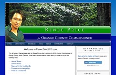 Renee Price (Democrat) running for County Commissioner, District 2. “ Why am I running, service to Orange County.” The main issues emphasized on her website (http://www.reneeprice2010.com) are sustainability, fiscal responsibility, and building community.
Her website is one of the most linked and connected. She is spreading her campaign through Facebook, Twitter, Flickr, YouTube. She also has videos on her website. Her website is very current with social media.
Her website has a blue and green color scheme. It is very classic looking. (I’m surprised there isn’t orange anywhere on most of these sites, Orange County!) Her website also includes ways to volunteer and contribute. You are able to donate to her campaign on the website through PayPal. This is extremely convenient, she also lists the numbers of e-mail subscribers she has. It looks like someone is keeping up with her website on a daily basis. I personally think she has one of the best websites.
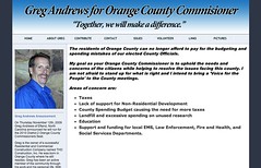 Greg Andrews (the lone Republican in this race) is running for District 2. His slogan, “Together, We Will Make a Difference,” is in the heading of this web site (http://www.gregandrewsocc.org). "My goal as your Orange County Commissioner is to uphold the needs and concerns of the citizens while helping to resolve the issues facing this county. I am not afraid to stand up for what is right and I intend to bring a ‘Voice for the People’ to the County meetings."
I think it is effective that Andrews lists his areas of concerns right away on the front page. If a viewer decides not to explore around the website, they right away can find out if Andrews has the same concerns for Orange County that they do.
He also has a way to contribute and volunteer to his campaign. The paypal has not been activated yet. Paypal is such an easy way to get money from people, it is convenient. Not as time consuming as having to mail a check. His website does have links, but not to social media. He has links to the North Carolina Republican Party and the Orange County Republican Party, people want others ways to be directly linked to Andrews.
The website is mainly blue and black colored and could use some updating. It provides a lot of information, but once again just looks outdated.
At-large
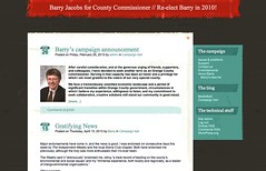 Barry Jacobs (Democrat) is running for re-election for county commissioner. The first thing you will see on his campaign site (http://www.barryjacobs.org) is his announcement to run. “After careful consideration, and at the generous urging of friends, supporters, and colleagues, I have decided to seek another term as an Orange County commissioner. Serving in that capacity has been an honor and a privilege for which I am most grateful to the voters of our very special county.”
What is distinguishable about Jacobs’s website is the WordPress theme. The format is very similar to a blog on WordPress.com. (How OrangePolitics of Jacobs.) It has a small picture of him to the left of the announcement which adds to visuals. I like how his site is set up for issues and positions. It asks questions in bold, and then answers the question. It is very easy to find the information that you are looking for.
Another important factor is ways to contribute. Jacobs’s site makes it easy to get involved with his campaign. The website lists options of how you would like to get involved with the campaign.
The pictures on Jacobs’s website stand out from the others, like the one in black and white of him as a child playing baseball. The link to his resume is also a great way to see everything that a candidate has done in the past. The blog categories for Basketball and Campaign trail are nice touches. Even with Jacobs attending Duke University, his website has nice Carolina blue touches.
Overall, Jacobs has a campaign website that has some style. Being set up as a blog makes it stand out from the rest. It makes the candidate feel more connected to voters, like he wants to keep all of his followers updated. It would be nice if this website linked out to Twitter or Facebook. Social media is crucial, especially in campaigning.
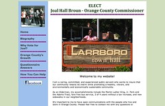 Joal Hall Broun (Democrat) is a member of the Carrboro Board of Aldermen running for County Commissioner. Her website is interesting to say the least. The opening picture you see on the site (http://uniqueorn.com/joalbroun) is Broun standing behind a Carrboro town hall sign. That same picture is then zoomed in and a smaller image on the left. The picture doesn't feel very professional, but she does seem enthusiastic about the campaign.
Aesthetically, I don’t really understand the color scheme. There is green, orange, blue, and hot pink. It just seems all over the place and not very appealing to the eye.
The main problem with her website is that there are not a lot of ways to reach out to her and help. There are no links to social media, which I think is crucial in a campaign. The section for “how you can help” only has her email address to get in touch with her. Unlike the other sites that have ways to contribute through the website. I understand taking an informal approach, but the website could use some updating.
I do like that she includes her answers to questionnaires. You can click on them and open a Microsoft word document. I think from Broun’s website is easy to see she is outspoken and outgoing, just needs a little updating to 2010.
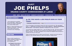 Joe Phelps (Democrat) is a former Mayor of Hillsborough running for County Commissioner. Phelps comes out swinging, the very first thing you see on his website (http://joe-phelps.com) is “Chapel Hill Herald says Jacobs is anti-economic development and Broun does not grasp the concept.” This is a message that is very different from the other candidate’s websites who have not discussed their opponents. Phelps’s website takes the approach of the homepage showing excerpts from The Chapel Hill Herald about the campaigns.
Phelps’s website is very formal and the design looks like similar to an insurance company. He lists which forums he will be attending. I think this is a great way to get people to follow his campaign if they know where they can go to listen to his viewpoints.
Information about donations and contacting him is extremely accessible and one of the first things that you see on his website. He also has a link to his Facebook which is a great way to incorporate social media.
His website is very concise with his points clearly stated. He does not get into long paragraphs which I think can cause readers to stray away from the website. The bullet points, or checks in his case, get straight to the point and express his involvement and key issues.
Another unique characteristic of his website is the very last tab, “The At-Large District,” which shows who this position actually impacts. There is even a map that shows the districts. This tab also lists the other candidates and what districts they are running for. This is a very smart tactic in making sure that voters are aware of who he is running against.
More Information:
Issues:


Comments
Compare and contrast
Very interesting, Ginny. Thank you for this! It's amazing how far we've come since 10 years ago when people thought a candidates were crazy for wasting their wasting time if they tried to campaign online.I wanted to mention for the OP old-timers (are there any of you left?) and the newcomers that this post was partially inspired by Duncan Murrell's gloriously snarky review of candidate yard signs in 2003: http://www.orangepolitics.org/2003/10/talking-in-signs
Thank, Ginny!
I'll never look at a website the same again. Really interesting. You have helped me see with new eyes.
Joe Phelps' Website
The bold-faced headings on Joe Phelps' website make it appear that the Chapel Hill Herald, or its editorial staff, is the entity criticizing Jacobs and Broun. In fact, the first article Mr. Phelps references was written by guest columnist Jeremy Todd Browner - "an attorney with a solo practice in Chapel Hill." http://www.heraldsun.com/view/full_story/6960646/article-Jeremy-Todd-Bro...
The second article on Mr. Phelps' website was written by a Chapel Hill Herald reporter. But the attack-oriented, bold-faced heading Mr. Phelps employs did not appear in that newspaper.
Screenshots
I just added an image to go with each review above. "A picture is worth a thousand words."
Too bad
nobody did a screen capture of Phelps' original web site. (Or did they?) At least the earlier comment forced him to add the attribution to Browner. But the new heading, "Chapel Hill Herald's Jeremy Todd Browner says..." is no more truthful than the original, "Chapel Hill Herald says..." Unless, of course, anyone who submits a letter to the editor automatically joins the newspaper's staff.