 The need for signs to help people find their way around town has been discussed for several years. The Town of Chapel Hill recently installed their first wayfinding signs. This initial step is welcome, but I'm a little disappointed with the implementation. First of all, I think they are needed downtown much more than at our entryways, which is where the program is currently focused.
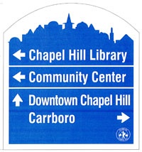
A few nights ago I was driving home on MLK Blvd and got my first look at the signs. They appear to be white text on a light blue background, rendering them nearly impossible to read! In addition, the UNC branding would seem to indicate that these are signs for how to get to the University, rather than to a variety of local destinations. And of course if the signs can't be read from a moving car, then they aren't doing much good on a 5-lane road.
The background appears to be a deeper blue when viewed above and on the Town web site, but that is definitely not what I saw on Tuesday night. Based on the responses I got on Twitter (see below), I'm not alone in my frustration with the design. I don't like to be this one-sided, but the more I think about the signs, the less I like about their implementation. Tell me the silver lining that I'm missing.
 Anitabadrock Anita badrockRT @orangepolitics: Kudos to CH on new wayfinding signs, but please fire the designer that put white letters on a light blue background. YEP
 JackieAtlas Jacqueline Atlas@orangepolitics I agree. The new Chapel Hill signs are impossible to read.
 jonkimball Jon Kimball@townchapelhill @orangepolitics. Pantone 278 should be on basketball teams, not Town of Chapel Hill road signs.
 alyssastep alyssa stepusinRT @orangepolitics Kudos @townchapelhill on new wayfinding signs, but please fire designer that put white letters on light blue background.
 qsopht Sam Sawyer@orangepolitics @townchapelhill - I was wondering if anyone else found that unnecessarily hard to read.
 amwhisnant Anne WhisnantAgree with @orangepolitics: Kudos to @townchapelhill on new signs, but who thought white letters on a light blue background would work?
More Information:
Issues:


Comments
I think I'm more bothered by
I think I'm more bothered by there being a horizontal line between the two items that both have the ← arrow but no line between the items with the ↑ and → arrows. If anything, it should be the reverse, grouping the two locations that are in the same direction.
Lessons learned?
This is an issue that is important to me, especially since I served on the Town of Hillsborough's Wayfinding Signage Task Force. Our plan has been approved, and the town will start installing them this fiscal year, with a total of about 80 new signs, a lot for our town (twice Chapel Hill's plan). When I went to Asheville on the recent Inter-City Visit, this was actually the biggest issue I wanted to hear about, since their new wayfinding signs failed after installation. Public response to the Asheville project criticized not using a local vendor (though no local company submitted a bid), not explaining the whole purpose of the program, and not taking down the old signs fast enough (they stopped taking down the old signs when the new signs failed). I asked their Visitors Bureau Director about this, and he mostly responded about the problems they are having with the sign manufacturer.![Chapel Hill Wayfinding]() However, I though his most interesting statement was that retail sales in downtown Asheville increased by 20% after installation of the signs. He acknowledged that this was a hard to substantiate statement, but put that out there anyway.
However, I though his most interesting statement was that retail sales in downtown Asheville increased by 20% after installation of the signs. He acknowledged that this was a hard to substantiate statement, but put that out there anyway.
When I saw the Chapel Hill signs last week, the sun was shining directly behind the sign, and it was impossible to read, I think partially because of the color choices. The sun also created a reflection on the sign material that created visible striations, distracting you from the signs message. I at first thought the signs were printed on corrugated plastic, it was so transparent, but on second inspection I believe that it is reflective metal. Since this is such a costly, but in my mind needed, public expense, I don't want Hillsborough to repeat problems in other towns. I hastily took a picture as a car passenger of Chapel Hill's sign that doesn't adequately capture the visual problem, but I think it shows the true color better than the image from the Town of Chapel Hill's web site. You can just make out some of those horizontal bands that were so distracting to me. I am having problems getting it to embed, but you can see it here.
I am interested that they chose to go the "pilot sign" route; I suppose that they can still be changed before the remaining 28 signs are installed. When the County opened the new library in Hillsborough, the sign in front of the library is one from the new Hillsborough design package, but it is a destination sign, not a sign designed for visibility when driving 40 mph. I don't believe that town has received much feedback regarding that one sign installation, but it is not in a very high visibility location.
Agreed, poor design
I agree. Very hard to read.
I almost went to Chapel Hill and I LIVE in Carrboro! :)
Poor color choice. Why no distinguishing line between Downtown Chapel Hill and Carrboro when their are lines between the other elements? The arrow is too far away from the word Carrboro. The designers need to go back to the drawing board on this one and try a field test this time.
I forwarded the link for
I forwarded the link for this thread to Catherine Lazorko, Chapel Hill's public information officer. Here are some comments from her:"Thankfully, we created test signs with the notion that we need to get this right before installing all the signs in the program. The sign company is not charging us for these pilot signs.We are aware of the contrast and readability problem of our prototypes. We are revising the colors, and everyone should be more pleased with the revised, including us! This is phase one of the project. A separate effort will be put toward the downtown pedestrian-scale way-finding program." In summary, what you see now is not the final product. Catherine's direct email is <clazorko@townofchapelhill.org>, probably best way to reach her. Ed Harrison
Well done
I'm so glad to see the the Town is open to change and learning from this experience. Kudos to Catherine, and thank you for sharing, Ed.
Glad to hear these are test
Glad to hear these are test signs. Kudos to the town for that. I continue to be amazed at how obvious things get overlooked in the name of "design." Road signs are used to find one's way around. Things like making the print larger and making sure the contrast between the lettering and the background works under all conditions should be part of Design 101 for road signs. It is imperative to have a sign that people can actually read in blazing sun, heavy rain, darkness, and when the car is moving. Function has to come first in this instance.
Use Existing Resources
There's no need to re-invent the wheel here. There is already a well-established hierarchy of signage colors that are used across the US, and that system provides cues to motorists who see signs of certain colors.http://www.trafficsign.us/signcolor.htmlFor that reason, the town might consider brown signs with white letters, which are associated with cultural and recreational interests. As to visibility, I had the opportunity to visit the Turner-Fairbank research center back in 2002, and their nighttime visibility laboratory is incredibly impressive. http://www.tfhrc.gov/about/pvl.htm They test the visibility of all sorts of types of signs for USDOT and state DOTs. Maybe a call from the design team to the Turner-Fairbank staff could help lead them to recommendations about nighttime visibility.
For comparison
http://www.lusterstudios.com/winterfest-downtown-raleigh-alliance-nc/
You can check out the associated pic at the link a few posts down. I tried displaying it here, but I haven't been able to put pics on OP for several weeks now for some reason.Another example:http://raleighskyline.com/content/2009/04/03/new-welcome-to-raleigh-sign/This is the most common one I see around Raleigh:http://www.travelpod.com/travel-photo/chipposgoglobal/1/1267886575/downt... And for all of them they are done rights so that the Blue & White works and is ledgible.
Chapel Hill
is more than downtown. Let's not forget that, Ruby.